Composition quickie

focal_points

Focal Points

What is the most important thing in your painting? The sailboat, the person, the farmhouse. When you are composing your painting it is important to establish a focal point before you start. The focal point is where your eye goes first. It is where there is the most contrast of light and dark, hard edges, strong color and whites.

The best place to position your focal points or areas? Draw a rectangle, divide it evenly into 9 sections horizontally and vertically. The intersections are where you position your focal point.


Demonstration of a small watercolour study


painting_demo1

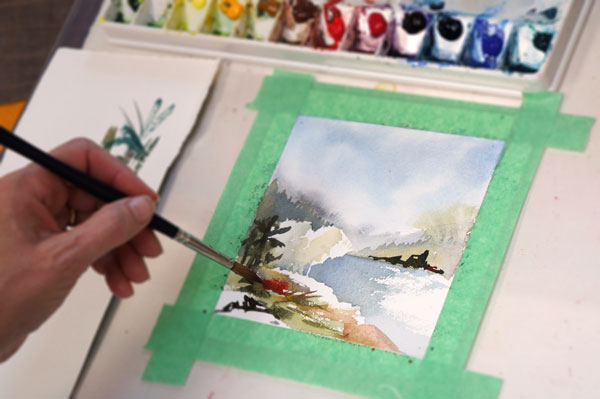
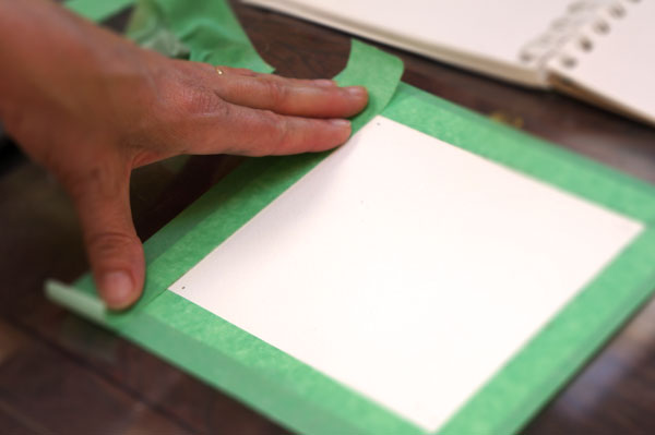
First tape down some painter’s tape to give yourself a defined area. The paper I am using is Arches cold-pressed, 140lb.

painting_demo2

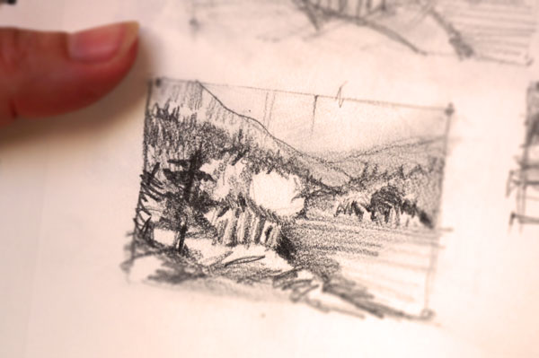
Here is a thumbnail sketch I did from memory. We will use it for the demo. Thumbnail sketches are great for capturing the main elements quickly.

painting_demo3

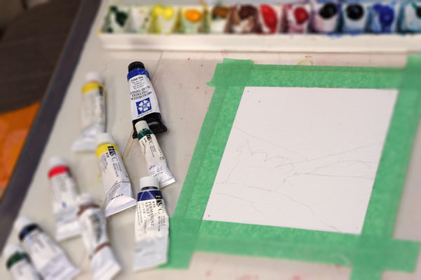
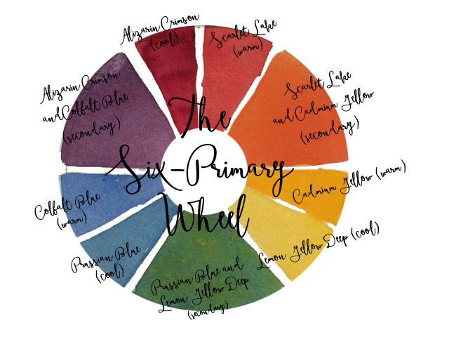
Now I have loosely pencilled in my sketch. Squirt out a little paint. The colors in my palette are: sap green, lemon yellow, cadmium yellow deep, raw sienna, burnt sienna, cadmium red deep, permanent rose,  permanent violet, cobalt blue, prussian blue, and viridian green.

painting_demo4

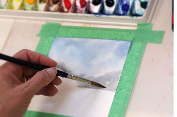
Start with the sky and wet the area with clean water, then charge in some cobalt blue mixed with a little burnt sienna. When that is almost dry you can start in on the mountains with the same mixture but add a little more burnt sienna to gray it down. Remember whenever you want to get a grayer version of your colour add it’s complement. To gray green add red, to gray orange add blue and to purple add yellow.

painting_demo6

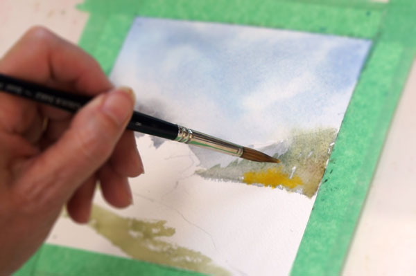
Add some green trees in front of the mountains before they are almost dry then charge in some yellow. To charge a colour add the yellow paint by touching it to the wet paper until the yellow has displaced the green. Also add the green grass in the foreground.

painting_demo7

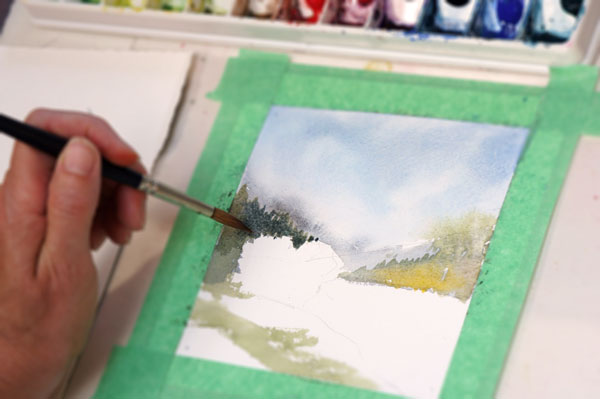
Next add some darks for the trees on the left side using cobalt blue, raw sienna, and prussian blue. The paper should be dry and make the tops jagged like a tree line. Also use this color to define the light tree shapes.

painting_demo8

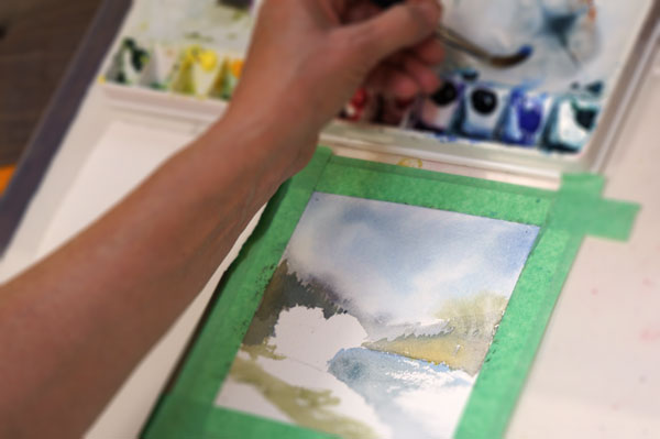
Paint the water leaving some dry brush marks on the right side. Start with a medium wet brush of cobalt blue and a little burnt sienna. Define the edge on the left then lift up to achieve the sparkles on the water.

finishing_touches

Adding the final details, dark trees on the near and far side, a little bit of light green for the trees mid-ground, and red charged into the grass.

final

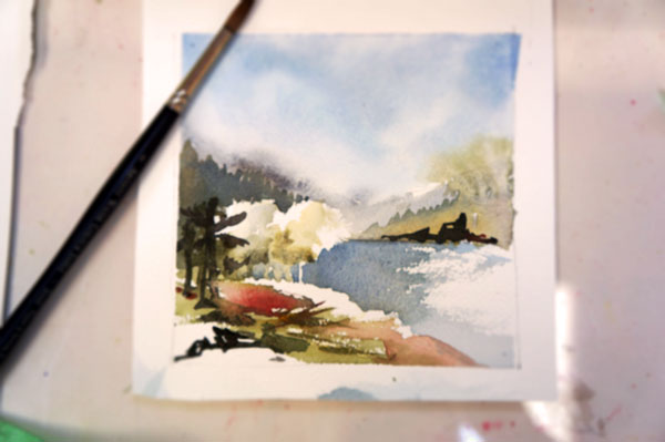
Remove the tape and it is complete. A lovely little study.

Do red and yellow make orange?

Six_primary_wheel2

You don’t need to know everything about color mixing to get nice clean colors in watercolor. Just the basics can help.

Colour Basics

The Six-Primary Wheel above uses warm and cool primaries that mix to get secondaries.

Primaries: red, blue, yellow
Secondaries: green, violet, orange
Tertiaries: blue/green, blue/violet, red/violet, red/orange, yellow/orange, yellow/green (mix equal quantities of primary and secondary)

Hue: is the color in its purest and simplest form ie. red, blue, green
Tone or Value: lightness or darkness
Intensity: brilliance of a color
Temperature: warmth or coolness

Colour Schemes

  • Monochromatic: one colour
  • Complementary: color opposite on the colour wheel, blue/orange, red/green, yellow/violet, (mixing complementaries produces neutral greys and browns, and provides the most contrast)
  • Analogous: colors related to each other on the color wheel ( provides a very harmonious and is good for emphasizing mood)
  • Complementary/analogous: analogous colors plus one complementary ( harmony from the analogous colors and balance from the complementary, mixing produces a wider range of dulled colors and greys)
  • Triadic: three colors in a triangular arrangement on the color wheel (produces the widest range of mixed colors and unique greys)

Colour Mixing

  • mix colors to reduce intensity and/or grey colours
  • to change hue
  • to grey a color add its complement
  • to alter a hue with minimal loss of intensity add the intense hue nearest it on the color scale. (ie phthalo cyanine green to go towards yellow mix with yellow lemon pale or light rather than cadmium yellow medium)
  • when mixing colors always start with the lighter color and add the darker
  • when two colors are similar in tone add the less transparent to the more transparent

Master the brush strokes

Ferry to Bowen

Brush strokes count when it comes to watercolour. How much paint vs water makes a very big difference.

Painting in watercolours is a process of mark-making. Although many watercolour painters may do an underdrawing in a pencil, they are less likely to do so with the brush; don’t paint in outlines – paint in shapes. The brush creates patches of colour which catch the light of an object. Watercolours are all about light.

The watercolour painter should explore a range of brushes and strokes, as well as different paints and papers. But, as a general rule, cheaper materials will hinder your development in watercolours. Believe in yourself: you deserve the best.

Painting in watercolours differs from other media in several ways. Watercolours have an immediacy that is quite different than painting in oils or acrylics. Many of oil painter Balthus’ works were painted over the course of ten or more years; most watercolour paintings are finished in less than an hour. A more important difference is that watercolours can be said to be painted backwards; a portrait painter covers a sheet of paper with colour except for the untouched white of the eyes. Look for, and work with, the white.

Learn to be critical of your own work and paint the same scene or subject often to help you better understand it. Paint in different light. Paint at different speeds. Paint the negative space around the main subject(s). Paint how you feel about the subject. Be bold. Embrace (and take credit for!) beautiful accidents.